
Imagine a pottery shop with a summer collection on its homepage. The photographs show the glaze and shape beautifully. The collection name, price and shipping dates also sit inside a promotional image. When the page loads slowly or a visitor uses a screen reader, those details can be hard to find.
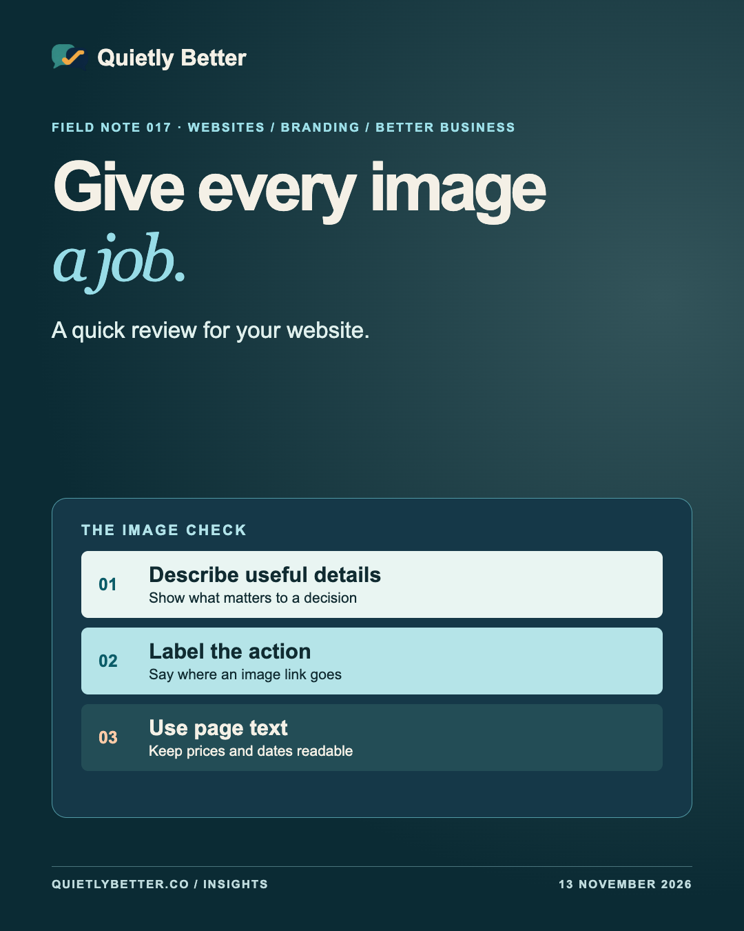
An image audit starts with a question about each picture. What would a visitor miss if this image were unavailable? The answer might be a detail about the product, the purpose of a link or nothing they need to act. That gives you a way to decide what goes in alternative text, what belongs in the page copy and what can stay purely visual.
Here’s a practical review you can run on one page before handing a whole site to a developer. The pottery shop and its products are fictional.
Pick one page and read it like a customer
Start with a page people actually use to decide something, such as a product listing, a service page or a booking page. Open it on a phone. Ask a colleague who doesn’t work on the site to find a product and explain what they’d get if they ordered it. Take notes where they need to zoom, where a caption is cut off or where they have to guess which picture opens which item.
Make a simple list of the page’s images, including logos, decorative photographs, icons and images used as links. Put one sentence next to each one that says what it contributes. For a product close-up, the job might be to show the finish around the rim. For a patterned strip between sections, the job might be to separate the sections visually.
The W3C Web Accessibility Initiative’s decision tree works through this distinction. Its guidance considers whether an image contains information, repeats nearby text, serves as a control or is purely decorative. Decide in the context of the page, because the same photograph may contribute different information in different places.
Describe the detail that helps someone decide
On the fictional pottery shop’s product page, a top-down view could show a small pouring lip that the title doesn’t mention. ‘Round blue bowl with a small pouring lip’ tells a visitor something the photo adds. A second view might show the bowl beside a hand for scale. Give that view a description that explains the comparison if it helps the purchase decision.
Keep dimensions and materials in the product description when they matter to the order. The photograph can show proportion, but the page can tell people the bowl is 15 centimetres across. Use the alternative text to describe the visible information the image contributes. If the important details are already clearly expressed next to a picture and the picture adds nothing in that context, the W3C decision tree points to an empty text alternative.
Ask the person who selects the images to write the first draft. They usually know which detail prompted the choice. The person who maintains the page can then remove repeated wording and check that the description still matches after the image is replaced.
Say where an image link goes
Some images also perform an action. A logo may open the homepage and a product thumbnail may open its detail page. For an image that is the only label of a link, the alternative text should give the destination or action. W3C’s functional-image examples distinguish between a logo on its own inside a link and a logo beside visible link text.
If the card has one link containing both the photograph and a clear product name, check what a screen reader announces for that link. If it reads the name twice or adds a filename, ask the developer to tidy the link label. If a standalone icon opens a gallery, the control needs a name that tells the visitor it opens the gallery. Test the actual interaction with the keyboard as well.
Put prices, dates and instructions in the page
A launch graphic can still do the visual work. Put the collection name, prices, delivery information and any deadlines in normal page text too. That text can reflow at different screen widths, and people can select it or adjust how it appears. W3C’s explanation of the images-of-text criterion describes the value of adjustable text and the exceptions for cases such as logotypes.
Read the same offer in the social caption, the product page and the checkout. If a date or price is essential to the offer, check that each step uses the current version. A graphic that has already been shared can be difficult to update. A clear caption and a link to the maintained page give customers a way to find the current details.
If you have a diagram or chart, put the point it makes in the surrounding text. Where the reader needs the full figures, provide them in a form they can read and work with. Write the page so the essential decision survives an image that never arrives.
Run the review again after the next update
Turn the audit into a short handover for whoever changes the page. Pick three images to fix first. An image-only booking link or a missing delivery deadline deserves attention before a decorative strip. Write down what the customer needs to learn and where that information now lives.
- Open the page on a phone and read the key details at a larger text size.
- Check what each image-only link announces and where it actually goes.
- Compare each informative image with its alternative text and nearby copy.
- Check that decorative images are skipped by assistive technology.
- Repeat the check when a price card, product photo or promotion changes.
Give someone ownership of the image check
Add these checks to the ordinary publishing routine. When a product manager swaps an image, they can confirm the new crop still shows the promised detail and update its description if necessary. When a promotion ends, the page owner can check the text as well as the graphic. A quick review at the time of the edit is easier than trying to remember why a photograph was chosen six months later.
Sources and further reading
Platform statements are linked to primary sources. The practical examples, recommendations and interpretation are Richard's analysis; they are not promises of reach, rankings or sales.
- W3C WAI — An alt decision treeGuidance for deciding what alternative text an image needs in its context.
- W3C WAI — Understanding images of textExplains the use of real text for information that people need to resize or restyle.
- W3C WAI — Functional imagesShows how image-only links and buttons can communicate their purpose.
Know someone
who would use this?
Share the article directly, copy its permanent link or download the finished artwork for a manual social post.
https://quietlybetter.co/insights/give-every-image-a-job