A website can look expensive and still make ordering a sandwich feel like applying for a submarine licence. There is movement, atmosphere and possibly a dramatic entrance. Somewhere underneath it all, a customer is trying to find the opening hours.
I like a bit of wow. Considered animation, an unexpected interaction and a beautifully handled layout can give a small business real character. But the design has to work for the person using it, not just the person presenting it on a very agreeable monitor.
This month's useful design conversation is not about adding another effect. It is about making a website easier to use without making it bland. A recent accessibility update provides the news peg; the practical work starts with reading, navigating, moving and asking for help.
The update: a future standard, not a panic button
W3C published an updated WCAG 3 Working Draft in September 2026. WCAG stands for Web Content Accessibility Guidelines in version 2; version 3 uses the name W3C Accessibility Guidelines and is intended to cover a broader range of digital experiences. Its developing approach includes changes to how accessibility progress could be reported.
The important qualification is that WCAG 3 remains incomplete and subject to substantial change. W3C's current introduction says the best preparation is to meet WCAG 2.2 success criteria now. This is not an announcement that every existing website must be rebuilt for a finished WCAG 3 standard.
For an owner, the sensible response is to ask better questions about the site you have. Can people actually use it? Where do they get stuck? What needs a specialist review? This article is a practical first look, not legal advice, a complete accessibility audit or a claim of compliance.
Your brand is also how the website behaves
A brand is not only the mark in the corner. It is the impression created when somebody tries to deal with you. If the business promises straightforward service but its website hides the next step behind a cryptic icon, the experience is arguing with the message.
Imagine a small accommodation business. A sweeping coastal video might establish the mood beautifully. But the visitor still needs to understand the room options, find availability and know where the booking takes place. The mood earns its place when it supports that journey. It becomes an obstacle when it delays or obscures it.
That example is illustrative, not a client result. The design principle is simple: decide what the page is helping someone do before deciding how it should perform. Distinctive does not have to mean unfamiliar at every turn. The business can have personality without making visitors learn a new operating system.
Readable beats faintly fashionable
W3C's design guidance calls for sufficient contrast, recognisable interactive elements, clear navigation and layouts that work across viewport sizes. It also warns against using colour as the only way to communicate information. Those are design decisions, not a layer of technical tidying added after approval.
A translucent panel over a photograph can be lovely. Check it over the light part of the photograph as well as the dark part. The headline that looked crisp in the selected screenshot may become a pale rumour when the image crops differently on a phone.
Try the actual page at a narrow width and enlarge the text. Does the information still make sense? Do headings sit beside the paragraphs they introduce? Are buttons labelled by their purpose? These are useful observations to bring to a designer; they do not establish that the whole site meets an accessibility standard.
Do not strip away all visual character in the name of simplicity. Keep the type, imagery and details that help people recognise the business. Remove the competition between them. Good hierarchy is often quieter than an extra box, another badge or a fifth competing call to action.
Put the mouse down for a moment
W3C's keyboard guidance explains why functionality needs to be available through a keyboard interface, with an exception for tasks whose underlying function depends on the path of movement. For ordinary business-site navigation, that makes keyboard use a basic design consideration, not an exotic extra.
As a first check, use Tab and Shift+Tab to move through the page without touching the mouse. Look for a visible indication of where you are. Try opening the menu, following a link and reaching the contact route. If focus disappears, gets stuck or moves somewhere confusing, record the exact step rather than simply writing 'navigation broken'.
This does not simulate every assistive technology or every person's experience. It is one limited check that can uncover obvious obstacles. A polished desktop walkthrough using a mouse should not be the only way a site ever gets tested.
Keep the movement. Lose the ambush
Movement can explain a relationship, acknowledge an action or make a transition easier to follow. It can also be a lot. A page should not insist that every person enjoys the same amount of motion just because the designer does.
W3C's guidance for Animation from Interactions, a Level AAA criterion, describes disabling non-essential interaction-triggered motion and respecting reduced-motion preferences as a technique. That is distinct from requirements about automatically moving content. A single pause button or a reduced-motion setting is not proof that every motion-related requirement has been met.
For a practical review, compare the normal experience with the device's reduced-motion preference enabled. Essential information and actions should still be available when decorative movement is removed. Ask your developer to check the implementation rather than assuming that the presence of a switch means everything honours it.
My design preference is for the interesting detail to reward attention, not demand it. The page can feel contemporary and carefully built while allowing someone to get the job done without watching the entire performance.
A form should help, not cross-examine
W3C's forms guidance recommends identifying controls with associated labels. A field needs a name people can understand and software can associate with it. Helpful instructions should explain any unusual requirement before somebody has to discover it by failing.
For a first conversation, ask what you actually need to respond. A hypothetical service-enquiry form might need a contact method and a short description of the job. Requiring a full project brief before saying hello can be an unnecessary hurdle. Some projects need more information; that does not mean every first contact does.
When something goes wrong, W3C's notification guidance calls for clear feedback that identifies the problem and helps people resolve it. 'Something went wrong' may be technically accurate, but it is not a particularly generous set of instructions.
Use a safe test environment to try an incomplete form, a mistaken entry and a successful submission. Then check the receiving end. A success message on the page is not, by itself, proof that the business received the enquiry. Never test with somebody else's details or casually send duplicate test messages into a live customer workflow.
Fast to appear is not the same as quick to respond
Google's web.dev guidance describes Interaction to Next Paint, or INP, as a measure of responsiveness to interactions. Its good threshold is 200 milliseconds or less at the 75th percentile of page loads measured in the field, considered separately for mobile and desktop. It is not simply a stopwatch on how quickly the first picture appears.
You do not need to memorise that to notice a menu that ignores the first tap. Try the important interactions on a real phone. Does the page acknowledge what you did? Does opening a panel feel immediate, or do you tap twice because nothing seems to happen? A lab check can help investigate, but it does not establish what all real visitors experience.
Treat performance and accessibility as related parts of usability, not interchangeable certificates. A quick page can still have an unlabelled form. A readable page can still freeze when you press a button. Each finding needs the right test and an honest description of what was checked.
A useful half-hour before the next campaign
Choose one genuine task: understand a service, find a product or start an enquiry. Follow it from the page a visitor is likely to land on, rather than always beginning at the homepage. Write down what happened and what you expected.
Use the checklist below as a first look, not a certification exercise. Fix the blocker that prevents the task before polishing something that already works. When a problem needs specialist testing, mark that clearly instead of decorating the report with a reassuring green tick.
Keep a small record: page, device, action, observed problem, person responsible and retest result. A specific note such as 'menu opens, but keyboard focus stays behind it' gives a developer something concrete to investigate. 'Make it more modern' is a rather longer afternoon.
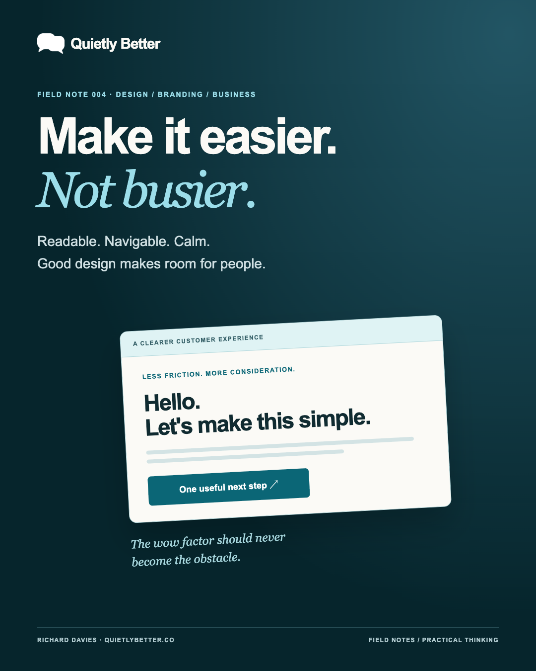
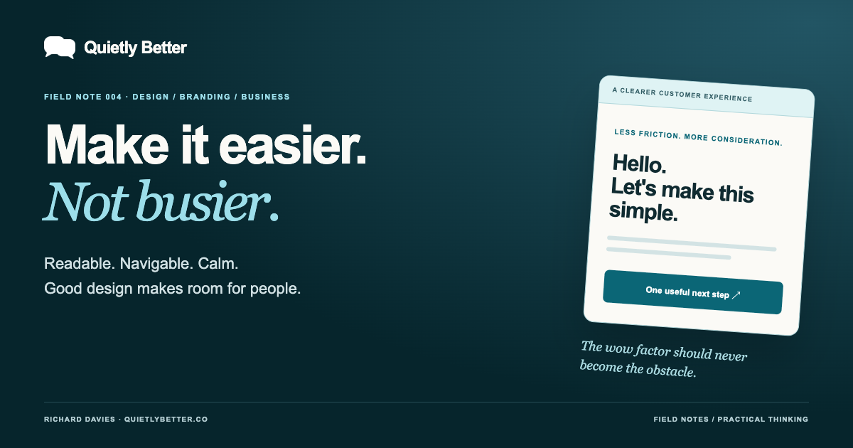
The wow factor should never become the obstacle.
- Read: check the offer, important details and next step on a narrow screen.
- Navigate: try the main journey with a keyboard as well as touch or mouse.
- Calm: compare decorative motion with reduced motion enabled.
- Respond: test the important controls and form feedback safely.
- Record: separate observed faults, untested areas and things needing expert review.
Better is something a customer can use
At Quietly Better, the starting point is a recognisable brand, followed by a custom website and connected social content. Hosting, ongoing care and practical systems support the work. The aim is not to squeeze every capability into every project; it is to choose the details that serve the business and the people dealing with it.
AI can help draft alternatives or organise a checklist. It cannot turn a screenshot into proof of accessibility, and generated code still needs its actual interactions checked. A useful brief asks for clear labels, predictable navigation and appropriate motion from the start, then makes room to test them.
You can be a small business with a distinctive, ambitious website and still make the important bits wonderfully straightforward. Let people enjoy the design. Let them also find the opening hours. Both are allowed.
Sources and further reading
Platform statements are linked to primary sources. The practical examples, recommendations and interpretation are Richard's analysis; they are not promises of reach, rankings or sales.
- W3C — WCAG 3 introductionSeptember 2026 update; WCAG 3 remains an incomplete draft. Checked 23 October 2026.
- W3C — accessible design tipsContrast, layout, navigation and interactive design. Checked 23 October 2026.
- W3C — keyboard accessibilityKeyboard-interface principles and exception. Checked 23 October 2026.
- W3C — Animation from InteractionsLevel AAA criterion; not interchangeable with automatic-motion requirements. Checked 23 October 2026.
- W3C — form labelsProgrammatically associated control labels. Checked 23 October 2026.
- W3C — form notificationsHelpful success/error feedback. Checked 23 October 2026.
- Google web.dev — INPInteraction responsiveness and field-versus-lab distinctions. Checked 23 October 2026.
Know someone
who would use this?
Share the article directly, copy its permanent link or download the finished artwork for a manual social post.
https://quietlybetter.co/insights/make-it-easier-not-busier