
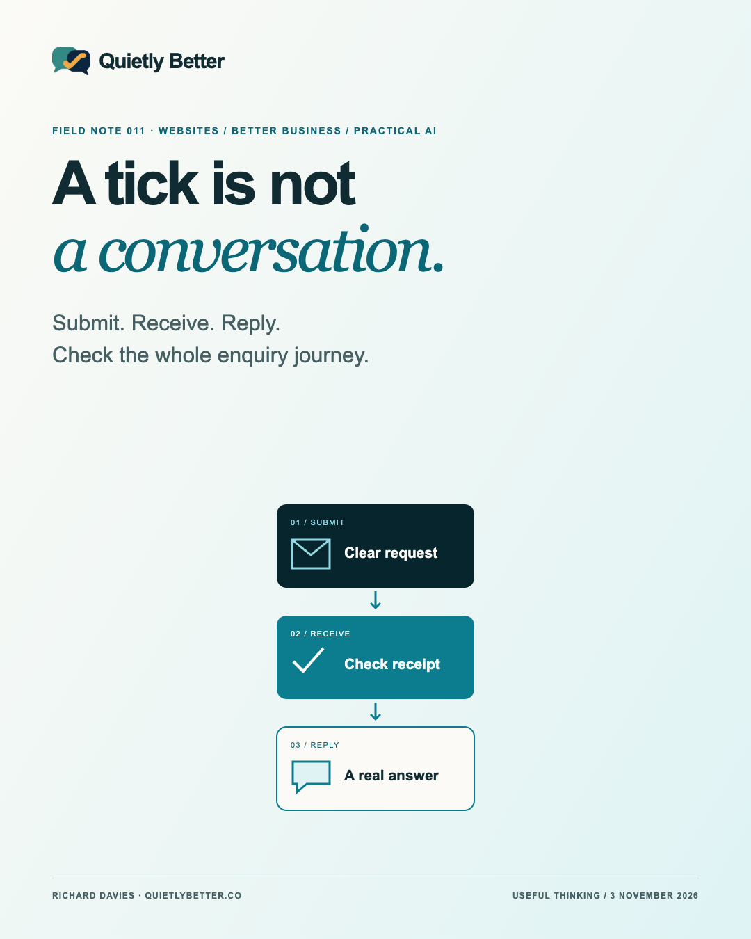
You send a message through a business website. A reassuring tick appears. Thank you, someone will be in touch. You put the phone down and get on with the day. At the other end, there might be a useful enquiry waiting. There might also be an email sitting in junk, an old address receiving it, or nobody responsible for checking.
That gap is easy to overlook because the visible part of a form is so small. A few fields, a button, a polite sentence. The actual job runs from a person deciding to make contact through to somebody receiving enough information to respond. The thank-you page is one checkpoint, not the finish line.
As producing website interfaces becomes easier, this is a sensible place to put some of the time saved. The following is a practical inspection method for an ordinary small-business enquiry form. It is not a report of a client failure or a claim that Quietly Better has tested your website. The examples are hypothetical.
The useful update is in the definitions, not another shiny button
For this Field Note I checked current primary guidance from W3C, Google and an email delivery provider. These are ongoing references, not breaking news or a new compliance deadline. Together they underline a useful distinction: helping someone submit, accepting their information and reaching a person are different jobs.
Resend’s documentation, for example, distinguishes an accepted sending request from delivery to the recipient’s mail server, as well as delayed, bounced and failed events. That illustrates the stages; it is not a recommendation to change providers. Other services have their own terms and evidence.
My practical conclusion is to give each important stage a clear meaning. A green interface should describe what the system actually knows. It should not imply that a human has read a message simply because a request was accepted. A pleasant sentence cannot do the work of a missing handover.
Start with the decision you want to make
Imagine a hypothetical garden-maintenance business. A prospective customer wants to know whether it can help with a small courtyard. The first useful decision is whether the work fits, where it is and how to reply. A detailed property history, compulsory account and three mandatory photographs may be unnecessary before that conversation.
Write down what the person receiving the enquiry needs to decide next. Build the initial fields around that decision. Mark optional details clearly, explain a required location or photograph, and avoid collecting information merely because the form builder offers a field for it. More detail is useful only if somebody will use it.
Keep the offer beside the form honest. A request for a quote is not a confirmed booking. A preferred date is not a reserved appointment. If inspection is needed before a price can be given, explain that before the button. Good wording prevents a successful submission from becoming a disappointed expectation.
Use real response arrangements. If you can normally review messages on the next business day, describe that accurately. Do not promise a two-minute reply because the template sounded confident. An owner working on the tools needs a realistic system, not a website making commitments on their behalf.
Make completion possible in ordinary conditions
Try the form on an actual small screen. Can you see the labels while typing? Reach the button without a floating panel covering it? Understand which details are required? Move through the fields with a keyboard? These are useful practical checks, although this exercise alone does not establish accessibility conformance.
Google’s web.dev guidance explains how appropriate standard fields and autocomplete values help browsers offer relevant saved information. Ask your developer to use meaningful email and telephone controls, rather than making everyone repeatedly type details the browser could help with. Then check the actual result on your devices.
Deliberately leave one required field empty and use an obviously incomplete test address. W3C’s forms guidance recommends clear feedback and errors that identify the affected field and explain correction. A message such as “Check the email address” is more useful than a mysterious failure number.
Do not discard a carefully typed message because one field needs correction. Test what happens after an error, a slow response and a second tap. The right behaviour depends on the system, but the customer should not have to guess whether to start again or whether two enquiries now exist.
Follow one test enquiry all the way through
Arrange a test with the person responsible for the website and the receiving mailbox. Use your own address and invented, clearly labelled test content. Agree who will watch the destination and when. Do not send experiments into another business’s form or use real customer details to make the test look convincing.
Record a short unique test reference, the time, the page used and the expected destination. Submit once. Read the exact confirmation. Then check the receiving system, including the relevant junk folder, and confirm that the message is complete and the reply goes to your test address.
If it has not arrived, preserve that reference and investigate the relevant application or provider record. Avoid hammering Submit: repeated attempts can create duplicates and make the first result harder to trace. A provider log and the recipient mailbox answer different questions, so keep both observations.
A useful test record might say: browser showed receipt confirmation; provider recorded delivery to the receiving server; test found in the nominated mailbox; reply received by the tester. Only write down stages you actually observed. A missing observation is a gap to resolve, not permission to tick the entire journey as complete.
- Visitor feedback: what exactly did the website confirm?
- Processing: did the application accept or retain the test as designed?
- Delivery: what does the actual provider or destination record show?
- Ownership: did the nominated person find it and successfully reply?
Ask the right email questions without rebuilding the mail system
If a form sends email, ask which service sends it, which business address appears as the sender, where replies go and who receives alerts about failures. These details can be different. The developer should explain them in plain language, including any dependency on an account, quota or subscription.
Google’s guidance applies specifically to personal Gmail recipients. It requires SPF or DKIM for all senders and has additional requirements for bulk senders, including SPF, DKIM and DMARC. It also recommends authentication more broadly. These are scoped provider requirements, not a promise that an authenticated message will reach every inbox.
Ask the person managing your email to check the actual form sender against the relevant provider’s instructions. Do not copy random domain records from a tutorial or change working email settings during a casual check. A website form is often only one of several legitimate senders for a business.
Keep the evidence modest. A mail server accepting a message does not prove a person noticed it. One successful test does not guarantee every later message. The point is to find obvious breaks and know where to look next, rather than declare email permanently solved.
Give the enquiry a person and a fallback
A shared inbox is a destination, not an owner. Decide who reviews new messages, how another person covers absence and how the team knows a reply has been made. A small studio may need only a consistent inbox routine and a simple status. It does not automatically need a new customer-management platform.
Choose an alternative contact route that you genuinely monitor. A visible telephone number or business email can help when the form fails, but only if the route works for your business. Explain if messages are checked during business hours. Avoid sending people to an unattended social inbox as a decorative escape hatch.
Plan for failure as part of the design. If a submission cannot be accepted, the person should see an honest failure message and an appropriate next step. If a notification fails after the application has stored the enquiry, the owner needs a way to notice and recover it. Those are different failure points.
Any stored-enquiry system also needs appropriate access, retention and security decisions. Keep customer messages out of public logs, shared screenshots and casual AI prompts. The simple option is the smallest arrangement that handles the real need responsibly, not an elaborate dashboard nobody opens.
Let AI help prepare the work, then verify the journey
AI can help draft shorter labels, suggest test cases and turn an approved process into a clear checklist. Give it invented examples and the business rules it may use. Ask it to identify assumptions rather than fill gaps with plausible opening hours, promises or staff names.
It can also help a developer review proposed form code. That output still needs inspection and testing in the actual environment. A convincing explanation is not proof that a destination is connected, a notification arrived or a reply reached the customer.
For a very small business, start with assistance around the work rather than automatic decision-making about the customer. Drafting a response for a person to check may be enough. Automated qualification or promises need a separately considered scope, reliable information and a clear route to human help.
This is where Quietly Better’s design and care approach fits: the words, interface and practical handover should agree. A polished page earns its place by helping the next useful action happen. The automation can wait until the ordinary journey is dependable.
Test the journey the customer needs, not only the screen the designer can see.
A small maintenance habit worth keeping
After a website release, form change, mailbox move or staff handover, repeat the agreed test. Also choose a modest recurring check that fits the business. Keep a dated note of what passed, what remained uncertain and who owns the next action. Do not turn a first test into a claim of continuous monitoring.
Measure useful stages separately: submissions accepted, enquiries actually received, genuine enquiries reviewed and replies made. Exclude your labelled tests. A form submission is not a sale, and a high count may include spam. Use those distinctions before deciding that you need more traffic or a different design.
The next step is simple: choose the contact route you most want people to use and follow one authorised test from beginning to reply. If you cannot say where it goes or who handles it, you have found a more useful website improvement than another animation. The tick is nice. The conversation is the point.
Sources and further reading
Platform statements are linked to primary sources. The practical examples, recommendations and interpretation are Richard's analysis; they are not promises of reach, rankings or sales.
- W3C WAI — Forms: User NotificationsOngoing primary guidance, checked 3 November 2026; clear submission feedback and useful error correction. Not a newly announced standard or a complete accessibility audit.
- Google web.dev — AutofillCurrent developer guidance checked 3 November 2026; meaningful standard controls and autocomplete attributes help browsers offer relevant saved details.
- Google — Email sender guidelinesCurrent guidance checked 3 November 2026; personal Gmail scope, all-sender SPF or DKIM requirement and separate bulk requirements. Authentication is not guaranteed inbox placement.
- Resend — Email event typesCurrent vendor documentation checked 3 November 2026. API acceptance, recipient-server delivery and delivery failure are different events; no product test or recommendation to subscribe.
Know someone
who would use this?
Share the article directly, copy its permanent link or download the finished artwork for a manual social post.
https://quietlybetter.co/insights/the-thank-you-page-is-only-half-the-job