A business can have a lovely logo, a decent website and an enthusiastic Facebook page, and still feel like three businesses sharing an email address. The colours wander. The offer changes somewhere between the post and the page. The customer arrives interested and leaves mildly confused.
That gap matters. Attention is only the beginning of the journey. What happens after someone notices you—what they find, what they understand and how easily they can act—is where the design starts doing useful work.
A few developments in search and social make this worth looking at now. Here is what the platforms are actually saying, what I think it means for a small business, and a practical way to bring the pieces together before the summer run-up.
The signals worth paying attention to
Google’s current guidance for AI Overviews and AI Mode says the usual search fundamentals still apply. Important information should be accessible as text, pages should be findable through links, and structured data should match what visitors see. Google says there is no special AI schema or extra AI text file required for these features. Eligibility does not guarantee inclusion. That is useful guidance, rather than a promise that one more technical trick will put a business first.
Meta’s March 2026 Facebook update says it is giving original work greater opportunity in Feed and Reels while reducing the distribution of unoriginal material. It distinguishes content made by the Page or creator from reuploads and minor alterations to other people’s work. This is Facebook’s stated direction, not a prediction of the reach any individual business will get.
Google’s Web Vitals guidance continues to focus on loading, responsiveness and visual stability. A page should arrive promptly, respond when someone uses it and avoid moving around unexpectedly. A striking animation earns its place when the rest of that experience holds up.
My reading of those signals is straightforward: put effort into information people can use, work that belongs to your business and an experience that makes the next step easy. The tools will keep changing. Those are useful foundations to carry with you.
Make the business easy to recognise, easy to understand and easy to deal with.
One business should have one clear voice
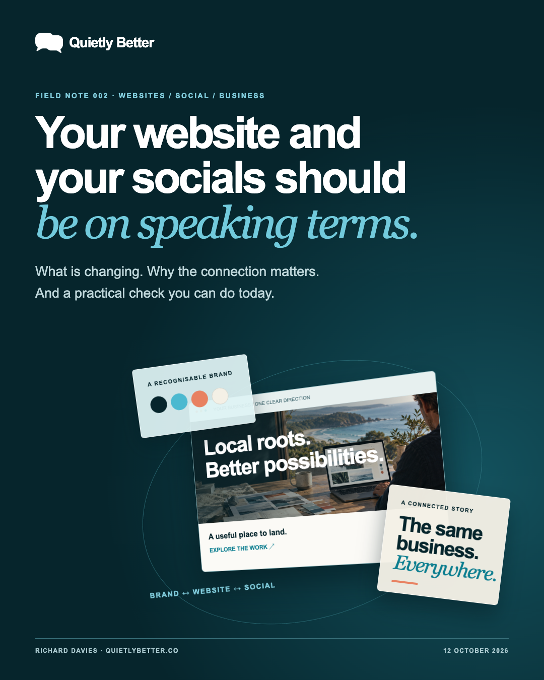
Branding is the thread through the whole experience. The website, social posts, booking confirmation and reply to an enquiry should feel as if the same person thought about them. They need not be identical. A Reel and a service page have different jobs. They should still agree about who you are and what you offer.
Start with three things: the customer you most want to help, the useful thing you do for them, and the reason they should feel comfortable choosing you. Write each in a sentence you would actually say aloud. That gives design and content something firmer to work with than ‘premium, innovative and passionate’—a phrase now available in quantities sufficient to dam a river.
Then set a few practical rules. Which colours belong to the business? What does a headline sound like? Which images feel true to the work? What is the main invitation? Keep those rules short enough that you will use them on a busy Tuesday.
Follow the customer from the post to the page
Take a hypothetical South Coast cafe promoting summer breakfast bookings. A post shows the food and explains the offer. The person taps through, expecting opening hours, the menu and a booking route. If the link lands on a generic homepage with last winter’s photograph and an unexplained ‘Contact us’ button, the thread has broken.
The page does not need a grand production. It needs the same offer, the correct details, useful photography and an obvious next step. If the cafe takes bookings by phone, say so and make the number tappable. If bookings happen elsewhere, explain where the button goes. If walk-ins are the normal arrangement, do not invent a reservation system for the sake of looking sophisticated.
This is why website work and social work belong in the same conversation. One introduces the business. The other gives that interest somewhere useful to go. A clear route matters more than a larger pile of assets.
- Choose one real customer action for each campaign: enquire, book, visit or buy.
- Send the post to the page that answers that particular need.
- Match the offer, wording, dates and imagery across both.
- Walk through the whole route on a phone before putting money behind it.
Original content starts with the actual business
The raw material is usually already there: the question a customer asked this morning, the job you completed yesterday, the detail people overlook, the owner explaining a choice, the product being used properly. A specific answer from someone who does the work is often a better starting point than another general motivational quote over a sunset.
You can turn one useful question into several formats. Explain it in a short video, show the detail in a photograph, write a concise post and keep the fuller answer on your website. Each version should earn its format. Copying the same paragraph into every available rectangle is distribution, but it is not much of a content plan.
AI is useful for organising the material, trying headings, preparing variations and assisting production. Someone still needs to check the facts, judge the quality and approve what goes out. For a small business, I would use that assistance to make the work more considered before making it more frequent.
The wow should help the work
Quietly Better’s website has a moving design system. You can switch between brand, website and social views, move the layered interface and see it settle. It is an example of what a custom build can do, and a small illustration of the connection this article is talking about.
Movement can guide attention, explain a relationship or give an interface a more physical feel. It also creates responsibilities: the site must work on a phone, controls must be usable without a mouse, and people who prefer less motion should get a calm experience. On our demonstration, motion can be paused and the animation rests when it is off screen.
Custom code is valuable because it lets the design serve the job. Sometimes that calls for an interactive tool. Sometimes it calls for a clear page with three photographs and a telephone number. Both can be excellent work.
A practical summer plan, starting now
Black Friday falls on 27 November this year. As at 12 October, there is a little over six weeks to prepare. Christmas follows, then the Australian summer trade. The useful response is to agree a direction early enough that the offer, content and website have time to work together.
Black Friday is not compulsory. A service business might be better served by explaining lead times or inviting bookings. A cafe may care more about holiday hours. A retailer needs accurate stock and fulfilment information. Choose the event that fits the business instead of borrowing someone else’s urgency.
Build an initial plan with room to learn. Decide what will carry into January, then review it against the actual enquiries and customer questions. Easter is a later planning checkpoint, not a reason to promise that one October campaign will keep performing for six months.
- This week: choose the offer or service, the customer and the main action. Check the website and social profiles for conflicting details.
- Next: gather original images, customer questions and the information needed on the landing page. Prepare a small, coherent content set.
- Before launch: check the phone journey, contact route, opening hours, deadlines and stock or availability. Confirm any advertising budget separately.
- During the campaign: look at useful responses and completed actions as well as reach. Keep notes on what customers actually ask.
- Afterwards: carry useful answers into the website and use the evidence to plan the next period.
Why I keep Quietly Better small
I am Richard Davies. Quietly Better is my studio on the South Coast, working with businesses across Australia. I spent 15 years as a part-owner and director at Edmiston Jones before running businesses of my own. I have also been working with computers and graphics since I was thirteen, starting on a VIC-20. The hardware has improved. The appetite for figuring things out has stayed fairly consistent.
That combination is the point of the business: design with an understanding of clients, budgets, decisions and delivery, alongside hands-on work in websites, content, applications and practical AI. My own publishing platform, The Splatter, and the Nice Things Dept retail brand are working examples of that approach.
You deal with me. I can bring branding, the website, social content and ongoing care into one direction, and agree what the work actually needs. The studio stays small so I can keep that responsibility close. As at this article’s publication, there is room for two more social-management businesses. That is a capacity decision, rather than a countdown that mysteriously resets every Monday.
If you are doing this yourself, the checklist below is still for you. Useful advice should remain useful after the sales invitation has left the room.
The twenty-minute check worth doing today
Open your latest social post beside your website on a phone. Pretend you have never met the business. Follow the link and answer these questions without supplying the missing information from your own head.
Fix the break in the journey before asking more people to follow it.
- Does it feel like the same business, in language as well as appearance?
- Can I tell what is being offered, who it is for and where it is available?
- Are the price or quote process, timing and important conditions clear where they are needed?
- Does the link take me to the information the post led me to expect?
- Can I take the next step without hunting, guessing or pinching the screen?
- Do I know who is behind the business and how to contact them?
Sources and further reading
Platform statements are linked to primary sources. The practical examples, recommendations and interpretation are Richard's analysis; they are not promises of reach, rankings or sales.
- Google Search Central — AI features and your websiteCurrent guidance checked on 12 October 2026. Standard SEO principles, accurate visible content and no special AI markup requirement.
- Meta — Rewarding Original Creators on FacebookMarch 2026 announcement on original content in Facebook Feed and Reels. It does not promise reach for individual businesses.
- Google — Web VitalsCurrent guidance checked on 12 October 2026. Loading performance, interactivity and visual stability remain central measures of page experience.
Know someone
who would use this?
Share the article directly, copy its permanent link or download the finished artwork for a manual social post.
https://quietlybetter.co/insights/website-and-socials-on-speaking-terms